Introducing the New Contested Histories Branding
By Jade •
Over the past few months, the Contested Histories team has been working with Carlos Marcelino to develop our new logo! We are over the moon with how it has turned out and it represents a crucial evolution for the Contested Histories project. In this post, we share our brainstorming, planning, and design process and explain why this new logo is so important to us!
Since early 2016, Contested Histories has sought to trace how disputes over public histories are played out through statues, street names, and other key markers of memory – this, in turn, has facilitated a broad understanding and catalogue of the nuanced practices used to resolve such disputes. Through careful research the project navigates the disputed spaces of history and memory, bringing to light the intricacies of each contested event, icon, and stance. By filtering through the strong emotions öften associated with issues of (mis)representation, the project seeks to unlock a middle-ground from which each case can be carefully understood, reflected upon, and studied within its own specific context. It is with this mission in mind that the logo was developed!

So, what does the new logo represent? The new logo, beyond being visually-pleasing (!), holds crucial meaning. It reflects the goals and future directions of the project, representing its commitment to fostering inclusivity and peacefulness, illuminating hidden histories, and tracing the rich, interwoven currents of public contestation.
Fostering Inclusivity and Peace

At the heart of the project is the highlighting of and mediation between opposing perspectives. In the new logo, this is reflected by the coupling of antagonistic shape placement and curved aesthetics. As you can see above, the logo – like the project – does not shy away from placing things in opposition. Shapes are placed directly opposite each other to represent how the project seeks to outline the conflicting stances of various groups on events, spaces and histories. Yet, by twinning this commitment to antagonism with an ethic of non-hostility, using curved font types and the colour blue, the logo represents a core value of the project: the importance of placing value in difference and of fostering an approach to conflict which precipitates openness, transparency, and resolution.
Illuminating Hidden Histories


Perhaps a more obvious goal of the project, given its name, is its focus on hidden histories and the creation of an academic space in which history is made up of multiple narratives. Histories are contested because they are intimate and dynamic – variously understood based on one’s own values and life experience. The project’s public-facing role works to bring this idea of an embodied, personal history to a wider audience, highlighting how such an understanding of history can begin to explain the emergence of conflicts over key historical icons, like statues. To reflect this, the new logo uses the letter ‘H’ in a unique and creative way! The letter has its middle bar partially hidden and, through this, an ‘eye’ shape is created. This acts as a symbol of how the project illuminates an understanding of history that is not always at the fore of public understanding, and its engagement with histories that may be hidden, overlooked or marginal to national or commonly accepted histories.
Tracing Interwoven Currents

Finally, the idea of a tapestry effect was chosen in order to represent how Contested Histories, by studying individual case studies, uncovers the patterns and trends which cut across different public contestations across the globe. Though our researchers delve deep into the nuances of each individual case, what the project as a whole seeks to understand is the commonality between cases and how such links can tell us something about how best to resolve disputes. In a tapestry, each symbol – each case study – coexists and interlinks with others to build a wider vision. In the same way, the Contested Histories project is built from individual case studies but contributes towards a wider understanding and analysis of contemporary events.
The Contested Histories Team is grateful to Carlos for his work in designing the logo and for expertly bringing together the many goals and voices that make up the Contested Histories project. Naturally, any interpretation of the meaning of the logo is subjective – and, who knows, maybe even contested! So, what do you think of our logo? Does it represent the Contested Histories mission? What else could have been included? Share your thoughts below!
Related Items
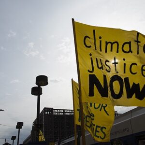
The Erosion of History: Climate Change and the Loss of Intangible Cultural Heritage

A conversation with Lidija Županić Šuica on teaching contested histories in Serbia